
Brand guide
The brand, the myth, the manual. Inside this guide you'll find the sacred blueprints of our brand-logos, colors, type, and the unspoken rules of looking like you know what you're doing. Stick to it and you'll blend in like a natural. Break it, and well... you'll hear from us.
This is our logo
This isn't just a graphic-it's the signature, the symbol, the visual mic drop. Whether it's scaled up on a stage or sitting quietly in the corner of a slide deck, it deserves to show up looking flawless. Follow these rules, and the logo will treat you right. Ignore them, and things get awkward fast.


Precision over clutter. Always
To keep it crisp, clean, and unmistakably ours, always surround it with clear space equal to the height of the "V" in the wordmark. That's your unit of measurement-apply it to all sides, every time. Remember: Close enough is never good enough. Use the "V" as your ruler, always.

This icon is designated for specific purposes
Voltage's icon is sacred and must be handled with care. We don't want to find this icon: hidden in backgrounds, squashed to one side, or used to dot an 'i'. Whomever dares touch this revered symbol will be cursed for life.

How not to use our logo
We know it's tempting to get creative-but our logo isn't here for your remix. It's been carefully crafted and deserves to be used exactly as intended. Here are the kinds of design crimes we're not cool with-and a few visual reminders of what never to do.

Keep it clean-shaven
No grime. No filters. No weird textures.

No freestyle colors
This isn't a coloring book. Stick to the mono logos.

Don't pull at the threads
No strokes, outlines, experiments gone rogue.

Don't bend it out of shape
No squishing, stretching, or "just making it fit."
Functional & confident colors
Our palette is designed, not just chosen. Every shade serves a specific function-whether it's drawing focus, signaling interaction, or keeping things readable. Stick to the system and everything stays sharp, clear, and intentional.
Core colors
These are the headliners. Use them as your base, your anchor, your go-to. They set the tone and hold the brand together.
Blue ribbon
#1966FF
Amp orange
#FF5000
System dusk
#131626
Supporting palette
Each color has a role to play. They're not interchangeable, and they're not up for debate. Use them where they belong, and everything will work exactly as it should.
Blue gradient
#1966FF / #19C9FF
Orange gradient
#FF5000 / #FFE600
Light BG
#FFFFFF / #D2EDFF
Dev BG
#131626 / #1966FF
Our voice, in type
We use two typefaces from the Halyard family. They're not just fonts-they're part of the brand's posture. They give us clarity, character, and consistency across everything from hero headlines to the fine print.
Halyard Display
Used for headlines and big, bold statements. Always set in Medium weight. It's confident without shouting-ideal for things that need presence.
Halyard Text
It's built for clarity and readability. Clean, quiet, and super legible at smaller sizes. The support act that makes everything work.
H1 Header
Halyard Display | Medium | 72px
H2 Header
Halyard Display | Medium | 36px
Body text. Also used for button text.
Halyard Text | Regular | 16px
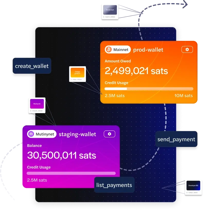
Bitcoin infrastructure for tomorrow's FinTech leaders.
Voltage Payments helps you move Bitcoin and stablecoins at near zero-cost. Is your business prepared to move at the speed of Lightning?
Book a Strategy Session